Brand Design Lead @ 0G, April 2025 - Present.

Overview
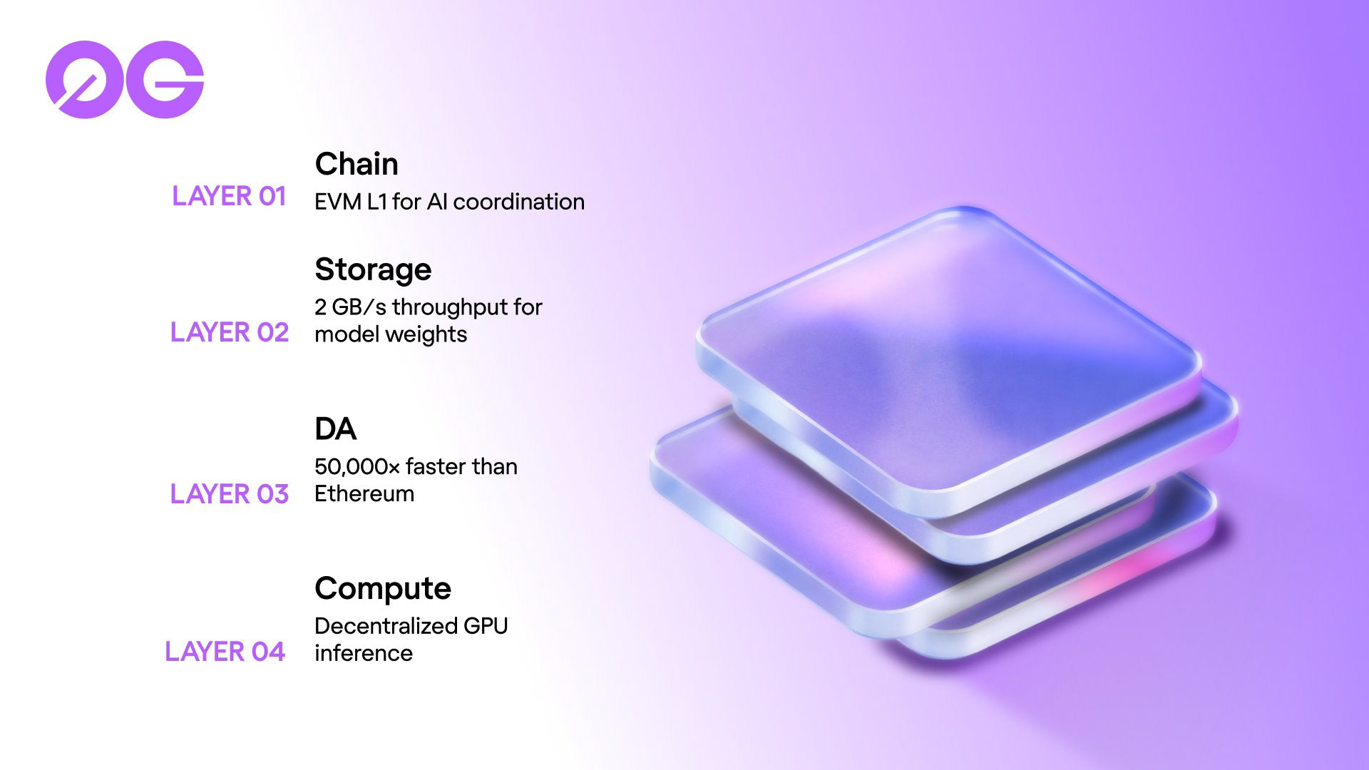
0G is an AI-native blockchain protocol building modular infrastructure for decentralized intelligence. I joined 0G Labs as the company’s brand design lead to build and define its visual identity — from the core brand system and design guide, to motion, web, and campaign work.
Because 0G manages several interconnected projects, I also support design direction across other initiatives, including the 0G Foundation. Balancing different brands and audiences has been both challenging and rewarding, and it shapes how I approach design systems, collaboration, and creative direction.
I started off as the sole Designer at 0G, so you can imagine that between events, campaigns, building the brand's core design system, mainnet and TGE preparation, and multiple brand refreshes, I stayed busy. With another designer now working under my direction, we're able to work faster while we continue to refine 0G's brand identity.
Building a Brand Mid-Flight
When I joined 0G, the company was in the middle of a complete rebrand. The new website was still being built by an external agency, and the visual system wasn’t yet defined. I had to continue producing marketing and community graphics in the old style while simultaneously shaping the new one.

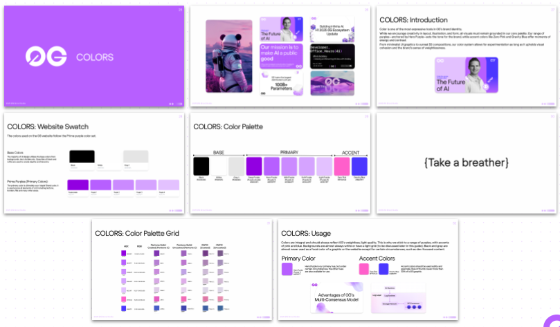
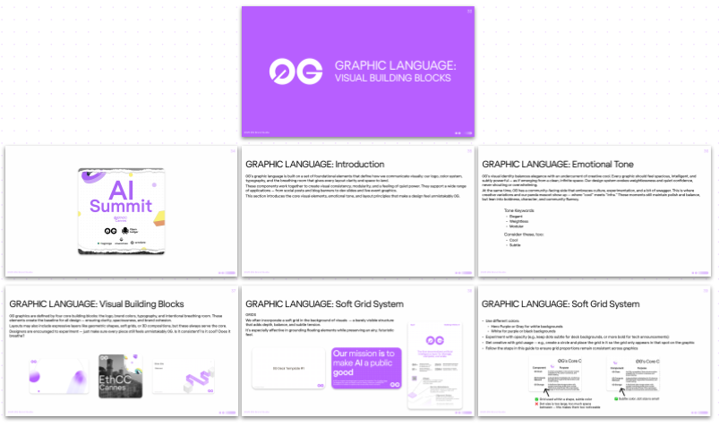
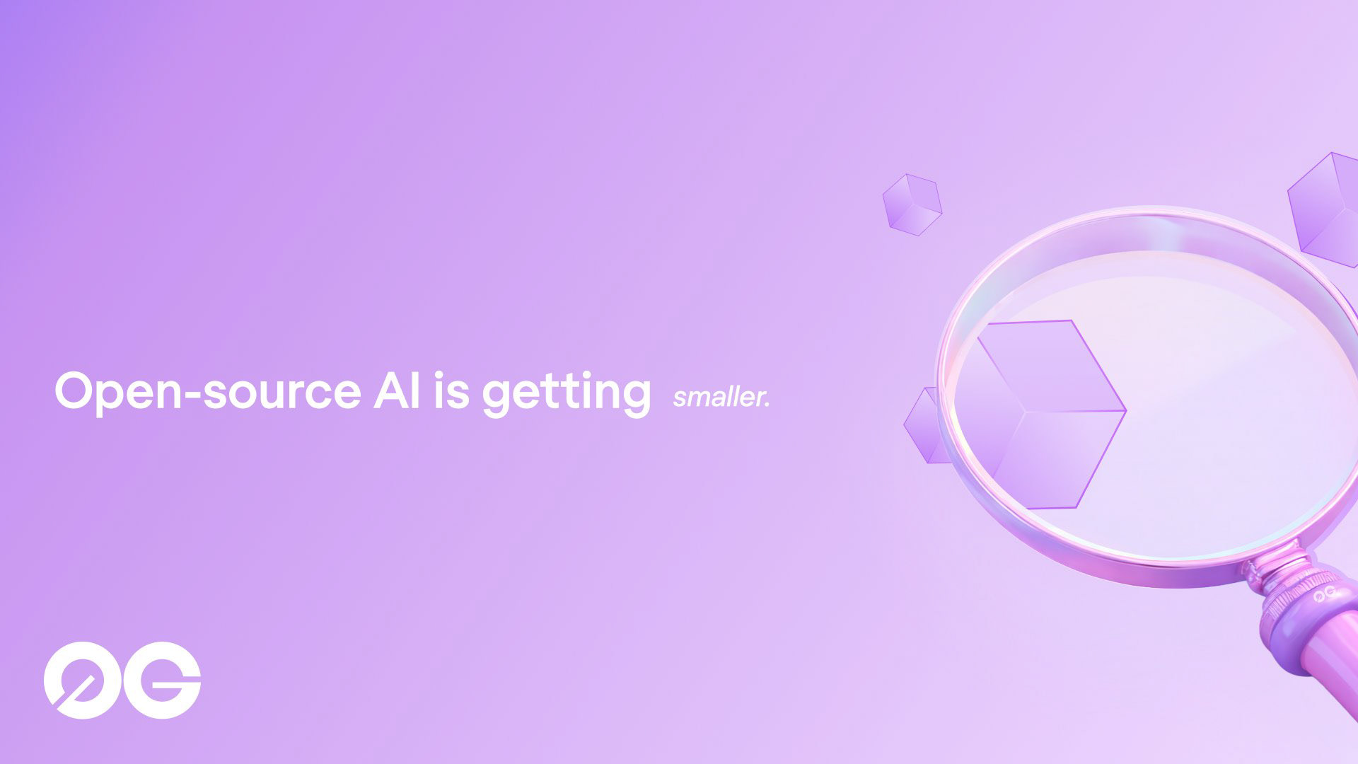
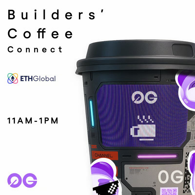
I began with the core brand elements — five purple tones with black, white, and gray — along with a few early assets from the agency, including isometric illustrations and a soft grid used on the website. From there, I developed secondary accent colors, refined the grid for broader use, and expanded the design system to include layout, motion, and visual behavior standards.
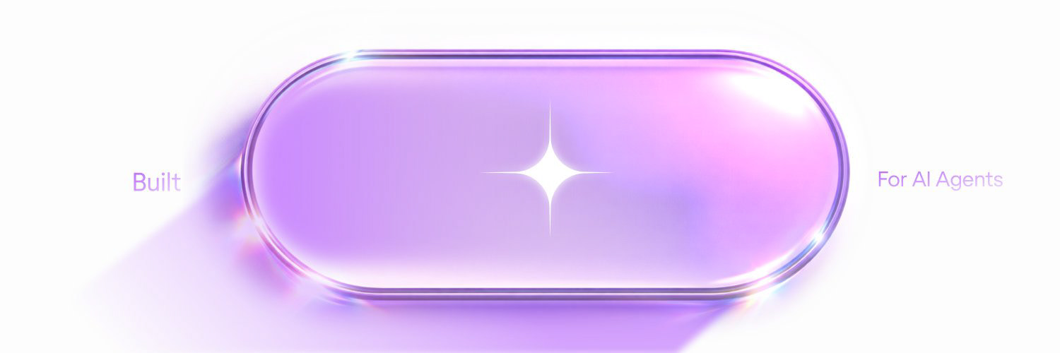
The site direction originally leaned into 3D illustration, which is common in our industry, but I intentionally pushed the general 0G look toward something more distinct — emphasizing clarity, light, and subtle dimensionality instead of full 3D scenes.
This process culminated in the 2025 0G Brand Guide — a foundation that defined logo behavior, typography, color logic, motion principles, and creative tone.
Brand System
The brand system was built to make 0G’s visuals feel unified across teams while staying flexible enough for anyone to build on, whether they’re a designer or not.
For new designers, it creates clear guardrails and removes the “where do I start?” feeling of joining a new company. For more senior designers, it acts as a launchpad so they can have a place to push ideas further while staying true to the 0G core.
The visual identity reflects 0G’s traits: intelligent, elegant, and weightless. It balances technical precision with a sense of cool, and is meant to express clarity and confidence without ever feeling heavy or loud.
• Typography: Regola Pro and Geist Mono
• Color System: Built on a five-tone purple core supported black, white, and gray, with accent colors (Zero Pink and Gravity Blue) that add contrast and energy
• Grid & Layout: The soft grid system provides structure and balance
• Tone & Emotion: Each design should feel spacious, confident, and consistent but never rigid, always leaving room for creative expression
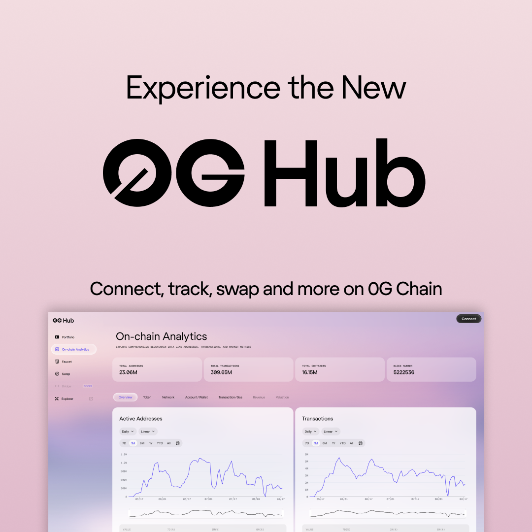
Digital & Motion Design
I created and directed visuals across 0G’s digital ecosystem to make sure the brand moved, behaved, and communicated in the right way.
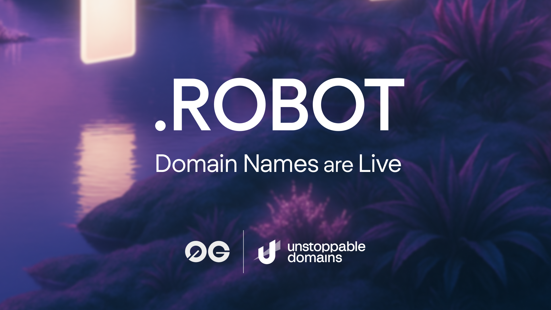
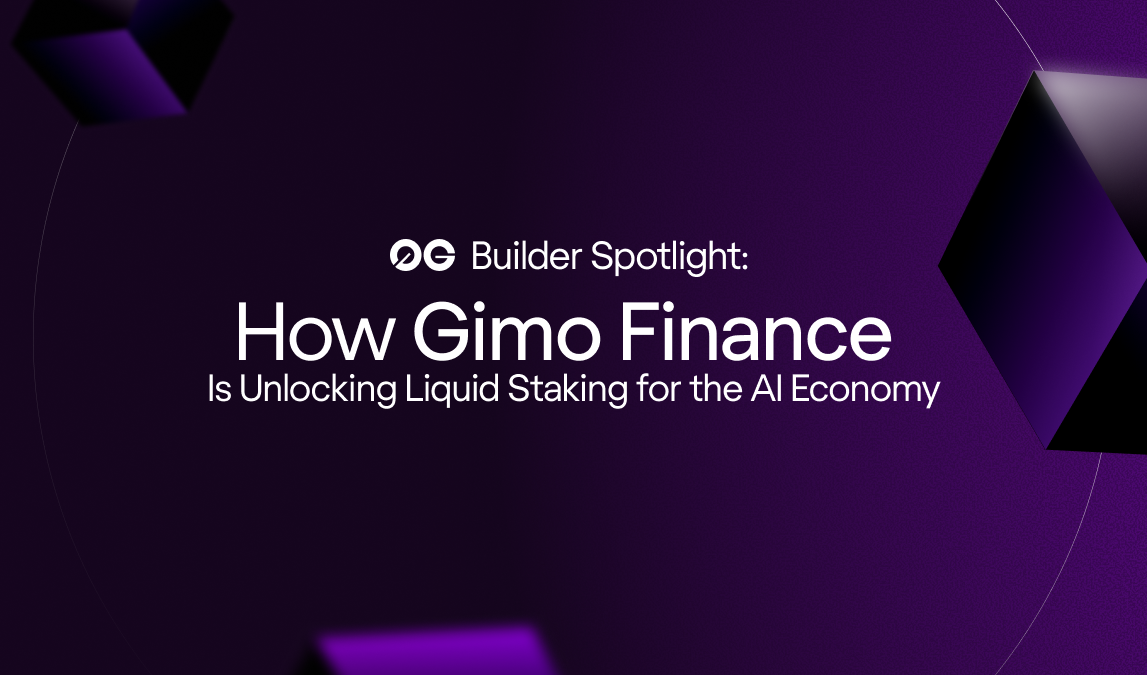
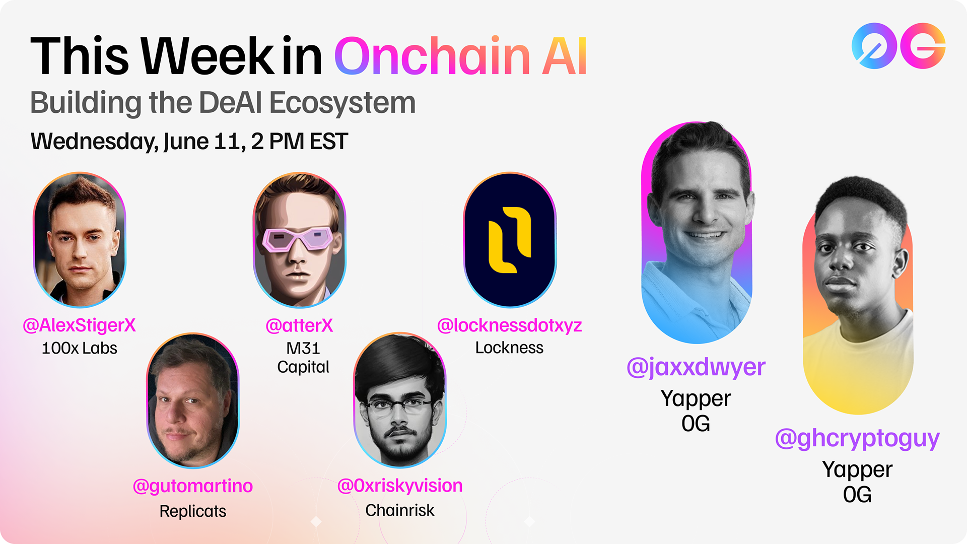
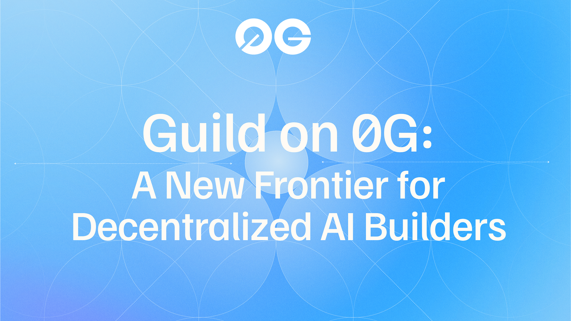
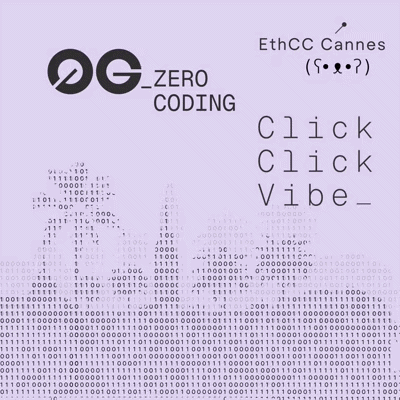
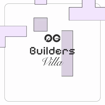
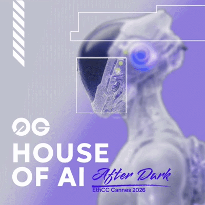
• Designed motion and visual assets across product, social, and campaign channels
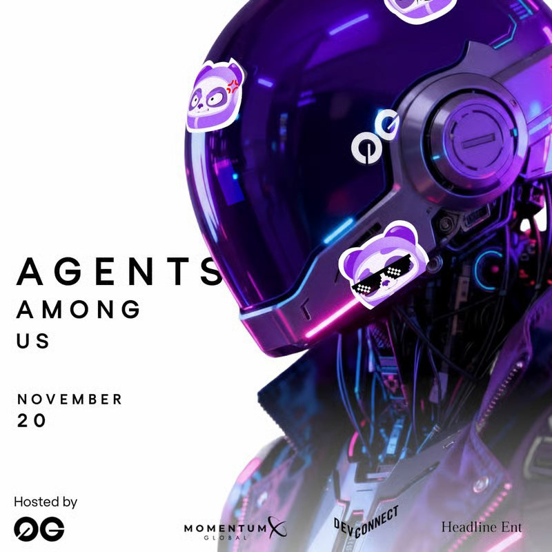
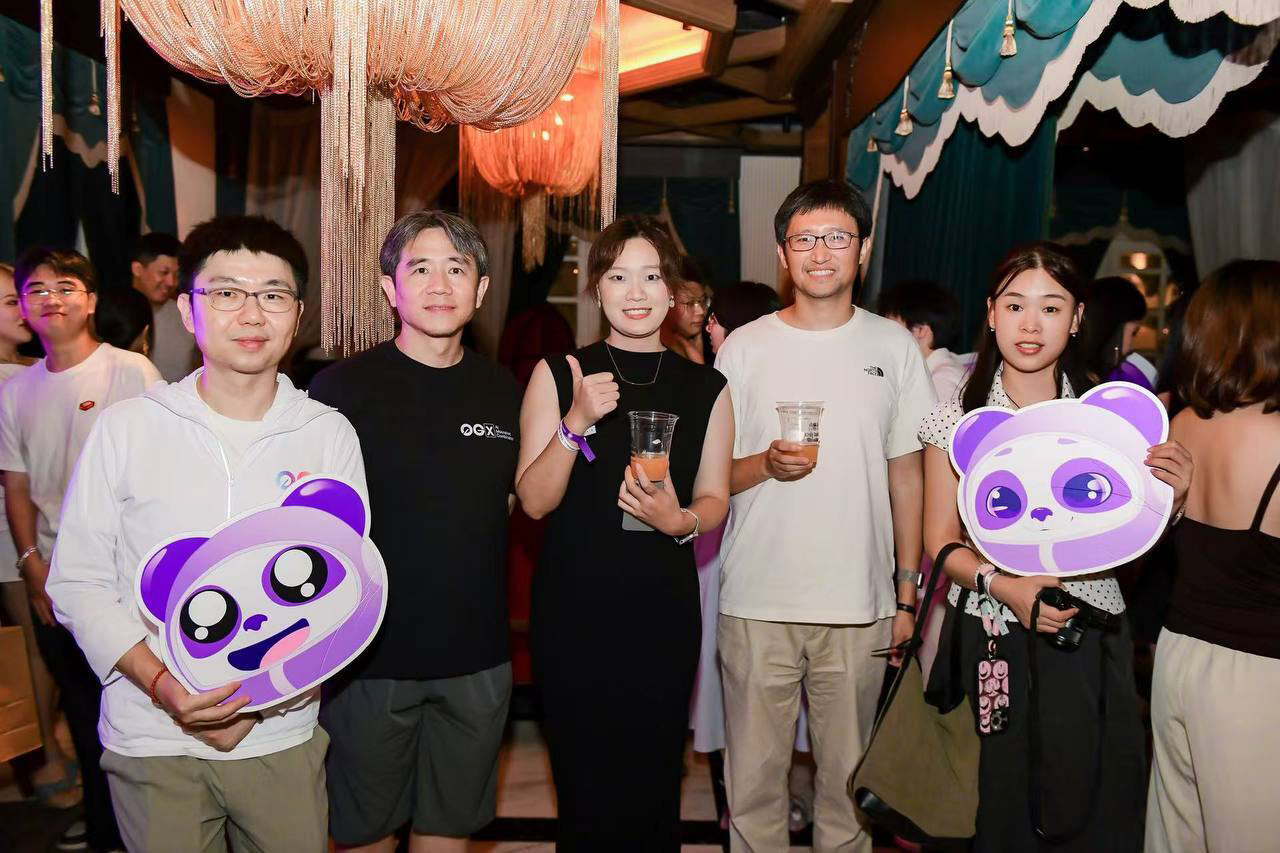
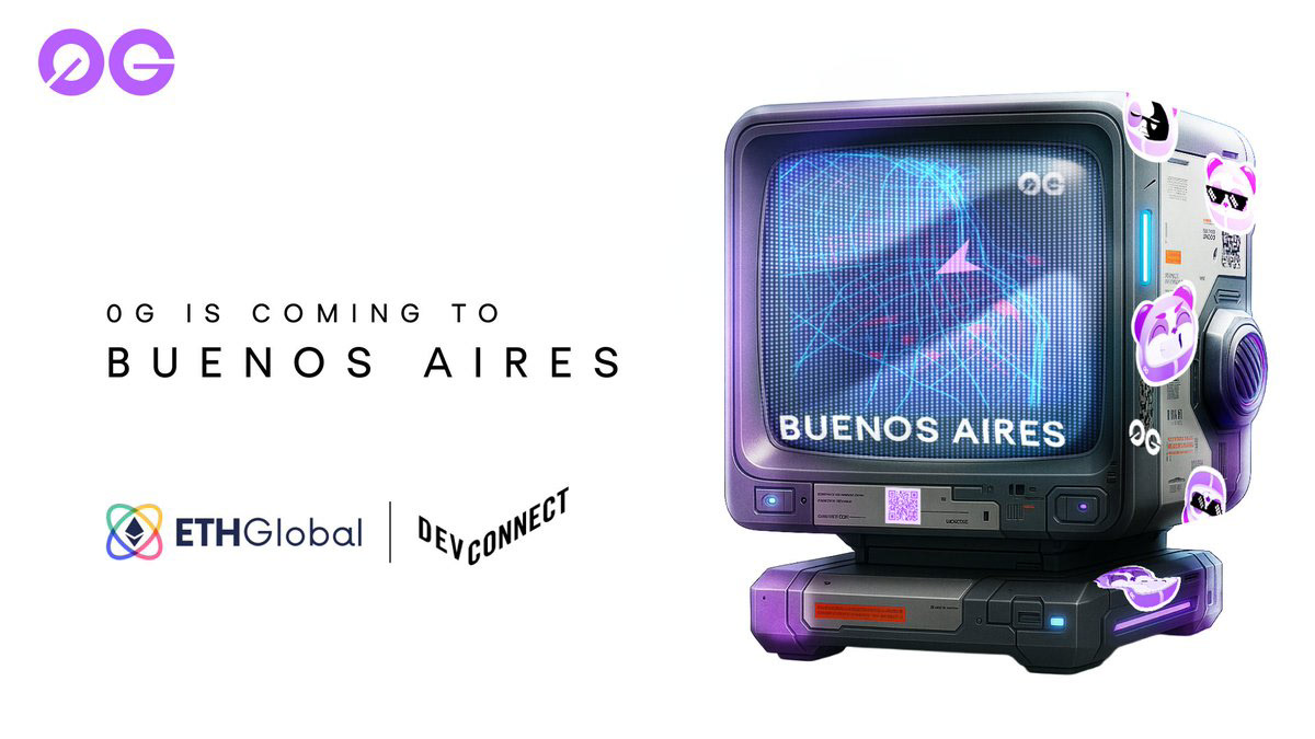
• Created launch graphics, social templates, and event visuals
• Directed short-form videos and partner content to keep the brand moving and alive
• Created launch graphics, social templates, and event visuals
• Directed short-form videos and partner content to keep the brand moving and alive
I also collaborated with external agencies, providing creative direction, scripts, and visual guidelines to ensure every piece aligned with 0G’s tone.


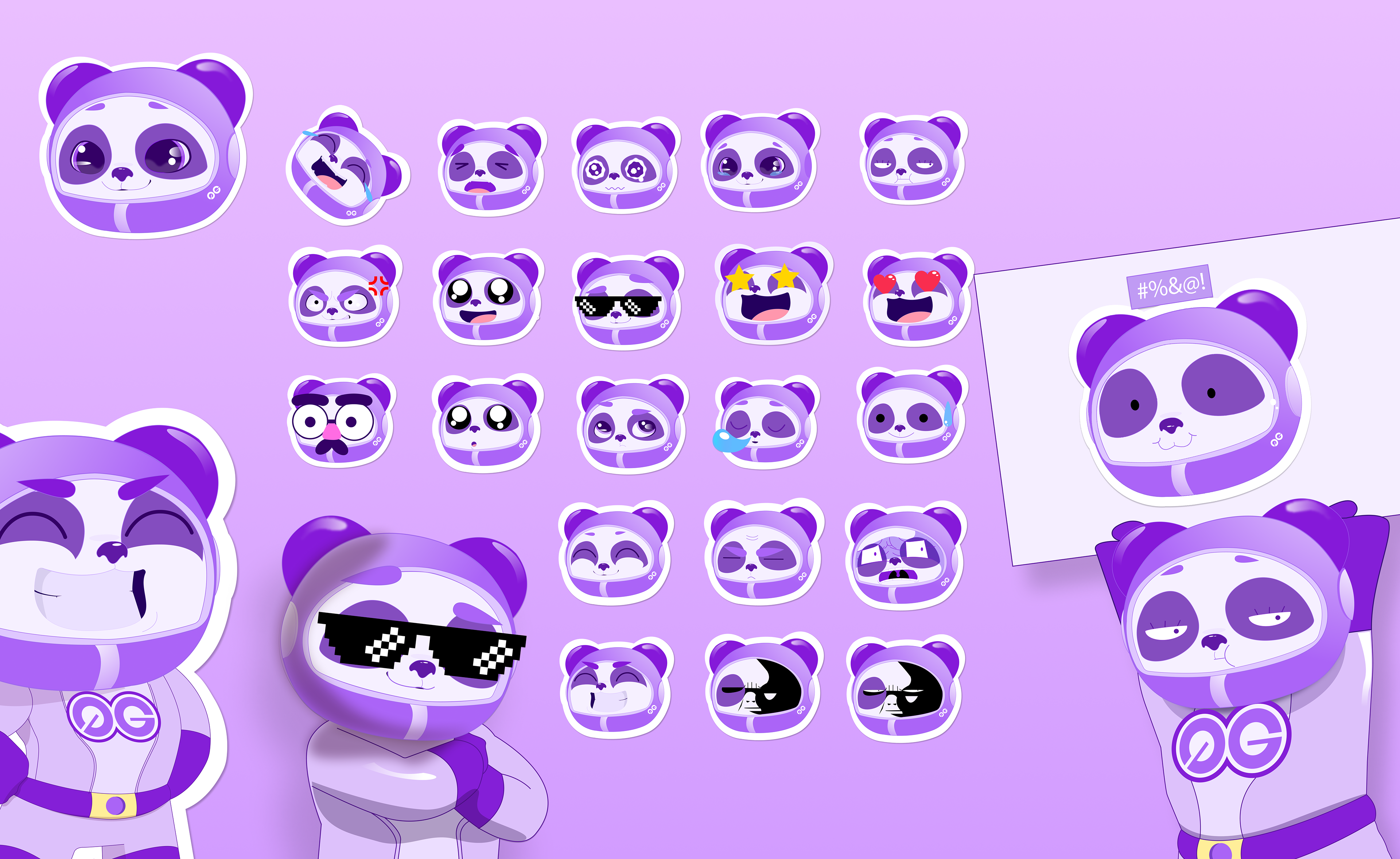
Process, Exploration, & Panda
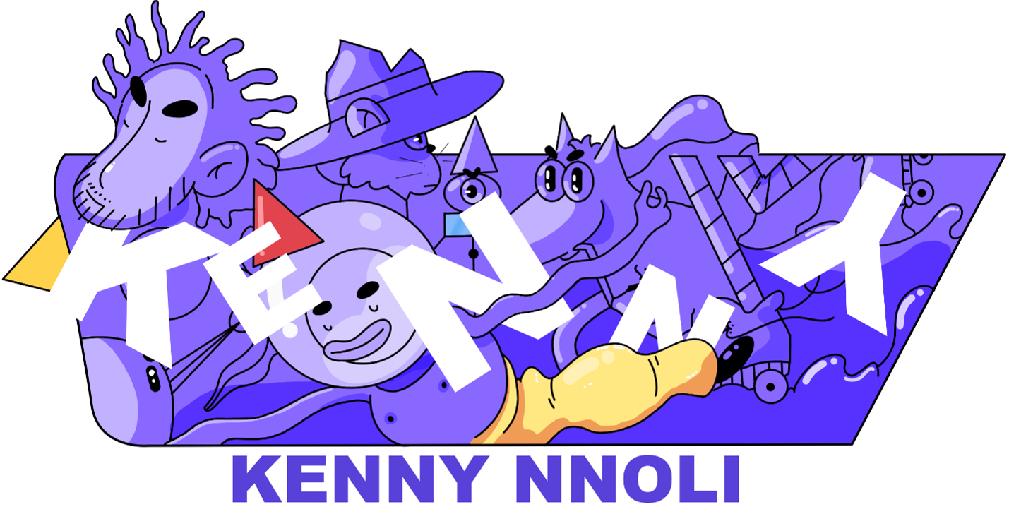
The design process at 0G has been highly iterative. I've worked closely with our CMO, refining templates through rounds of feedback while having the freedom to experiment. One of the most defining parts of that process has been re-creating the 0G panda mascot — exploring a new visual style that quickly became a team favorite and a central expression of the brand.
In terms of tools, I use Pinterest and Behance for inspiration, FigJam and Figma to collaborate with the 0G team, and AI tools like ChatGPT, Flux Playground, Grok, and more to ideate and prototype new ways to express 0G’s visual identity.
Onward and Upward
We've since gone through a refresh, bringing more light, clarity, and a dash of 3D to our illustrations. We're leaning into pink tones and experimenting with more directions for events and campaigns.
Wrap-Up
With an additional designer now under my direction, we're bringing even more fresh ideas to the table. As she provides hands-on support, I'm able to help direct that creativity and vision while further refining the brand's identity and systems.
0G’s brand is intentionally open-ended and built to evolve. There's more to be done, but I'm confident we're headed in a direction that's in sync with 0G's core goal of pushing the boundaries of what's possible.
